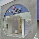
The biggest challenge in this project was to make 1705 Sq. Ft Jewellery showroom looks grand and exclusive. We wanted to make this project look seamless and thought of creating a flow. Though the place being considerably small, we had to work out with the floor heights and ended up by adding a mezzanine level. Now the showroom sits elegantly in the business hub of Vadodara, on the R.C. Dutt road, Alkapuri.
Moroccan architecture mesmerised our sense of designing and thus we planned to take inspirations from it and follow its design principles. “BOLD MINIMALISM” was the mantra that we chanted. We wanted to create a subtle fusion between Modern Contemporary and Periodic styles. We planned to work more over the elevation as it comes in direct contact with the viewers on the main road. Capturing eyes was our goal. There is a big circular opening in the front elevation cast in concrete, with fixed glass. This opening proves to be the best for trapping northern lights.
Functionality was our prime priority and had to be highly taken care off. Because it falls under the retail segment, we were occupied in throwing light over the business cycle and its success ratio. The counter heights, display area, storage and other essential functions followed the standard anthropology. Certain specific displays were customised by having a simple grey backdrop with optimum lighting and minimum design elements, which would only highlight the product displayed. Thus the focus was maintained on the showcased jewellery.
In order to make it look grand and royal, white colour was used in overall interiors. It is accompanied by Indigo blue. In the flooring blue galicha tiles are used in complimentary to white mosaic tiles. The tapestry of the chairs and sofa is also handpicked thoughtfully to enhance the colour scheme. Inspired by the Moroccans, minute details have been worked out and crafted sensitively over MDF, later on, topped with white wall paint. The overall colour palette contains grey of exposed RCC, white and indigo blue.
The main USP of the project is a vertical wall, customised and designed with Indigo and White ceramic mosaic patterns. With the help of superb workmanship, we have been able to produce the idea, which was on paper up till the execution level.
A wall adjoining to the staircase houses some of the most beautiful and antique wooden frames thoughtfully chosen to embrace the interiors. The artefacts add to the royal touch and elevate the experiential journey from the ground floor to the mezzanine level.
The chandelier hanging above the entrance foyer is customised from brass and light fixtures with handmade glass. The elegance of it directly compliments the items showcased in the showroom. Due to the sensitive play of lights, the products are highlighted and brought to focus.
In-spite of having space constraints, we were able to provide functions such as cash counters, owner’s cabin, accounts cabin, toilet, pantry and a strong room.
After completion of this project, we are able to add one more feather to our cap of success. It gives us immense pleasure when we see our client satisfied and contended.


