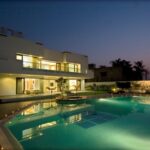
Located within a 2 ½ lac sq ft plot of land is a bungalow fondly known as Anand House. This sprawling 13,000 Sq. Ft white structure sits elegantly in this plot and is gently enfolded by stately mango trees and manicured lawns. When the clients, who are two brothers, approached DGA, their brief was quite simple. The interiors had to be conceptualised keeping three words in mind – elegance, sophistication and simplicity. “When the clients approached us the house was complete at the architectural level. The structure had quite a modern form and some really fantastic spaces – it was the perfect canvas for us to explore our ideas,” says Dipen.
At the entry itself one is struck by the vastness of the foyer, which gives an indication of the spaces to come. The lavish Italian marble floor continues throughout most of the ground floor exaggerating the vastness of the space and lends balance to the dark, rich veneers used.
The living and dining spaces exemplify the clean lines that DGA is known for. The muted tones provide an appropriate background for the rich walnut veneer used in the furniture. Carefully selected artefacts add beauty to the otherwise stark space. The custom built dining table is starkly minimal, but a steel bowl for floating flowers built into it is a simple yet elegant detail.
Large openings overlook the grounds and draw the outdoors into the house. A fine example of the emphasis given to ensuring that the surrounding greenery was made a part of the interior is a bay window that overlooks a lilly pond. This is one of the nicest places in the house. In the words of the client, “This really is a great place to sit and unwind after a really hard days work. There is an almost meditative feel to this alcove and I love sitting here and watching the sky change as the sun sets.”
Offset from the dining area is the bar area, which is undoubtedly the most dramatic space of the entire house. Here horizontality meets verticality making this double-height space truly spectacular. The bar itself is an elegant combination of glass and silver Travertine marble and the double heighted wall clad with rustic grey tiles is the perfect backdrop to the bar. In this area one has a view out into the garden as well as the sky above. The beauty of this space lies in experiencing the ephemeral play of light as the day progresses.
A silver travertine baithak with a built in planter has been cleverly introduced into what would have otherwise been a dead transition space. Above this area is a skylight fitted with a re-tractable roof. This transforms the space into a courtyard that funnels warm air out of the house. This courtyard separates the bar area from the family room. While the same muted tones and clean lines are continued into this area, a more casual and informal approach was taken when conceptualizing this space. Rustic off white tiles were used in the flooring and mushroom colour was introduced on one of the walls. A nu wood mural designed by one of the DGA team adds detail to this space. Sheer curtains provide shading but allow a muted view out over the swimming pool area.
As one moves from the outer living spaces to the bedrooms, a subtle shift in ambience is noticed. The starkness of the common spaces gives way to a more personal, slightly more ostentatious feel. This change is gradual and so cleverly brought about that one perceives it almost at an emotional level rather than in a visual way.
Each bedroom exudes a distinct personality. The children’s bedroom is a surprise and a complete departure from the rest of the house. Here the predominant colour is white- this was preferred as a canvas for the children’s own toys and artwork. The mirror terrazzo detail in the bed back is an interesting element that the kids can enjoy. This monochromatic colour scheme is broken by the colourful wardrobe shutters, which are a combination of white, burgundy pink and green.
Warm brown tones characterize the rich romantic ambience of the master bedroom – which is exactly what the elder brother and his wife wanted. A carved ‘tree’ motif in nu wood forms an arresting backdrop to the bed. In stark contrast the bedroom of the younger brother exudes a decidedly masculine personality with the use of black laminate, dark wooden flooring and dark accessories. In both the parent’s room and the guest room a more neutral colour palette is used in combination with dark veneers.
To sum things up Dipen says, “It was a real challenge to do the interiors of this house because of its size and the different areas involved. Maintaining the underlying character of the house was important, but equally important was ensuring that things didn’t get repetitive. I think that we have been quite successful in achieving this.”
Project Fact file
- Client’s Name – C.Patel
- Built up Area – 13000 Sq. Ft
- Design Team – Dipen Gada, Yatin Kaviya
- Architects – CAN Architects, Mumbai
- Landscaping – Ashish Tuli, Ahmedabad
- Site Coordinator – Comfy Interiors
- Photography – Tejas Shah


