Client Brief
The client is from the real estate background and works with large scale government projects. They are majorly into infrastructure development. They wanted to do an office that’s well connected to nature, thus the plot they selected to build their house and office named Shivalaya has an adjoining garden on the west.We were approached as interior designers to do third, fourth and terrace floor of the building for their office along with a nice and cozy entrance to the building.
Site Brief
The building has been designed by Architect Ruchir Seth with brick and concrete façade which accommodates a basement and 5 floors above for various usages. Out of these, they were keen on developing the third, fourth and terrace floor as their workplace – office space.
Design Brief
Their requirement was pretty simple. They wanted interiors to accommodate all their staff well with workstations done in a way that allows for ample natural light throughout the day and making the office as communicative as possible to create a beautiful environment for the team.
The client wanted a contemporary and modern touch to this space. Fortunately, the building is open on all four sides, and we get ample natural light from three sides throughout the day, which made it possible to do an easy and energetic layout.
Entrance Area
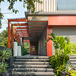
The journey starts from an experience of entrance aisle on west side of the building which is visually connected to the garden. The entrance aisle is a colorful and fun strip of passage with a stark screen rendered in orange with artful cutouts inspired by Daali and the green connect offered by the garden behind creates a dramatic entrance to the place. Surrounding floor and walls are done in charcoal black. An exposed brick wall has been incorporated to give balance to the building façade. This wall also forms the backdrop for office logo.
Third and Fourth Floor
Then as one reaches third floor of the building, one encounters coral finish kota façade used on the staircase wall with motivational quotes etched on it. A beautiful art door which is done by Avinash leads one to the reception and waiting area.
A bold design statement has been attempted by introducing a blood red metal staircase, which not only breaks monotony but at the same time infuses a different level of vibrancy and energy to the double heighted waiting area.
The overall color palette is more or less in shades of grey right from flooring to walls and major furniture as well. All floors have been done from the Nexion sand series of tiles in three color variations to give it a natural look. This monotony has been broken by the use of a few colors on the staircase and reception floor. A semicircular glass partition was designed as the backdrop for reception and to cutout work area from the outside. The workstations have been placed in the center of the workspace along with glass cabins on both the floors for Senior Employees and heads, Managing Director and conference area.
There is a play of metal in all the workstations with an industrialist effect mostly in grey laminates. Most of the ceiling is kept open with needful services visible.As most of the interior is muted with grey influence, DGA breaks it with a few bold and energetic art pieces. Art is what gives soul to the space. Entrance has a wonderful sculptural boat done by Chandra Shekhar.
Terrace Area
The terrace floor is beautifully done. It is done in a way that people can come unwind and recharge themselves during lunch breaks or after office. It has a small pantry, gathering space, and seating for lunch and play.


